🏷 How to Build a Custom Badge Web Component with Theme, Size, RTL Support, and Icons
Creating a Badge web component with RTL, size, Theme and Icon
Full stack developer Meet/Discuss with me : https://cal.com/biomathcode
Badges are small UI elements that provide contextual hints, often used to represent statuses, counts, or metadata. In this article, we’ll walk through how to create a modern, customizable <x-badge> Web Component.
✨ Web Components provide encapsulated, reusable UI with native browser support. Let’s use that power to create a badge that adapts to any theme or language direction!
1. Create a Simple Badge Web Component
We start by defining a basic custom element using the HTMLElement class.
main.js
class BadgeComponent extends HTMLElement {
  static get observedAttributes() {
    return ['dir', 'size', 'theme', 'variant'];
  }

  constructor() {
    super();
    const template = document.createElement('template');
    template.innerHTML = `
      <link rel="stylesheet" href="./styles.css" />
      <slot name="icon"></slot><slot></slot>
    `;
    this.attachShadow({ mode: 'open' }).appendChild(template.content.cloneNode(true));
  }

  attributeChangedCallback(name, _oldVal, newVal) {
    if (name === 'dir') {
      this.style.setProperty('--dir', newVal);
    }
  }
}

customElements.define('x-badge', BadgeComponent);
attributeChangedCallback
This lifecycle method lets us respond to attribute changes:
attributeChangedCallback(name, _oldVal, newVal) {
  if (name === 'dir') {
    this.style.setProperty('--dir', newVal);
  }
}
“This is where your component becomes reactive to external changes, just like frameworks do under the hood.”
🧑🎨 2. Styling the Badge with Variants and Themes
Why use :host and ::slotted?
:hostlets us style the outermost custom element (<x-badge>) based on its attributes.::slotted()targets user-provided content like<span slot="icon">.
styles.css
:host {
  display: inline-flex;
  align-items: center;
  font-family: sans-serif;
  font-weight: 500;
  border-radius: 1em;
  white-space: nowrap;
  direction: var(--dir, ltr);
  font-size: var(--badge-font-size, 0.75rem);
  gap: 0.4em;
  padding: 0.2em 0.6em;
  background-color: var(--badge-bg, #e0e0e0);
  color: var(--badge-color, #000);
}

/* Themes */
:host([theme="light"]) {
  --badge-bg: #f0f0f0;
  --badge-color: #000;
}

:host([theme="dark"]) {
  --badge-bg: #333;
  --badge-color: #fff;
}

/* Variants */
:host([variant="info"])     { --badge-bg: #2680eb; --badge-color: #fff; }
:host([variant="positive"]) { --badge-bg: #2d9d78; --badge-color: #fff; }
:host([variant="negative"]) { --badge-bg: #e34850; --badge-color: #fff; }
:host([variant="warning"])  { --badge-bg: #fca73c; --badge-color: #000; }

/* Sizes */
:host([size="s"])  { --badge-font-size: 0.625rem; padding: 0.1em 0.4em; }
:host([size="m"])  { --badge-font-size: 0.75rem;  padding: 0.2em 0.5em; }
:host([size="l"])  { --badge-font-size: 0.875rem; padding: 0.3em 0.6em; }
:host([size="xl"]) { --badge-font-size: 1rem;     padding: 0.4em 0.7em; }

/* Icon */
::slotted([slot='icon']) {
  display: inline-flex;
  align-items: center;
  justify-content: center;
  block-size: 1em;
  inline-size: 1em;
  color: currentColor;
  margin-inline-end: 0.3em;
}

:host([dir="rtl"]) ::slotted([slot='icon']) {
  margin-inline-start: 0.3em;
  margin-inline-end: 0;
}
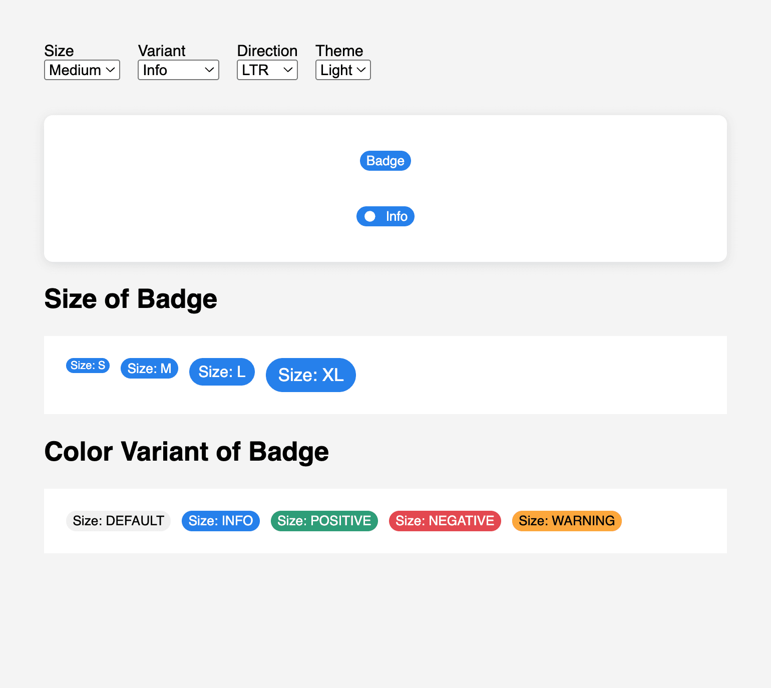
📏 3. Add Size Property
The badge supports size="s", "m", "l", and "xl".
This is handled by setting --badge-font-size and adjusting the padding accordingly using the :host([size="..."]) CSS selectors.
“Using CSS custom properties for sizing allows easy overrides and scaling.”
🌐 4. Add Support for RTL and LTR
We can use the dir attribute to support right-to-left languages like Arabic or Hebrew.
<x-badge dir="rtl" variant="info" size="m">
  <span slot="icon">🔔</span> إشعار
</x-badge>
When dir="rtl" is present, we switch icon spacing using :host([dir="rtl"]).
The attributeChangedCallback in JavaScript dynamically updates a --dir property so it can be used in direction.
✨ 5. Icons Inside Badges
Use <slot name="icon"> for inline icons:
<x-badge size="m" variant="positive">
  <span slot="icon">
    <svg ...>...</svg>
  </span>
  Success
</x-badge>
The icon remains scalable and vertically centered, with automatic margin on the correct side depending on direction.
📄 6. Putting It All Together
index.html
<x-badge size="m" variant="info" theme="light">Info</x-badge>

<x-badge size="l" variant="positive" theme="dark" dir="rtl">
  <span slot="icon">✅</span>
  ناجح
</x-badge>
You can dynamically create or update badges via JavaScript:
const badge = document.createElement('x-badge');
badge.setAttribute('variant', 'warning');
badge.setAttribute('theme', 'light');
badge.setAttribute('size', 'xl');
badge.textContent = 'Alert!';
document.body.appendChild(badge);
🧠 Final Tips
Use CSS variables for all spacing, colors, and typography.
Add
aria-labelor use<slot>meaningfully for accessibility.Consider adding
icon-onlymode or badges with dismiss buttons.
Final Codepen - with Full Code
🔗 Stay Connected & Explore More
If you found this article helpful or want to see more UI experiments, open-source components, and thoughts on building better interfaces: